UX Research for Major Ballet Company
UX Research Goals
Gain deeper insights into the platform’s current user base and make necessary updates to the existing archetypes to ensure their accuracy and authenticity.
Identify and comprehend the specific pain points that users encounter while navigating the website, allowing us to clearly pinpoint areas that require further enhancements.
Familiarize ourselves with the website’s current structure and create a well-structured Information Architecture based on a comprehensive analysis of users’ feedback, stakeholders’ insights, and UX suggestions. This approach aims to significantly improve the website’s user-friendliness, providing an optimal experience for users.
Process
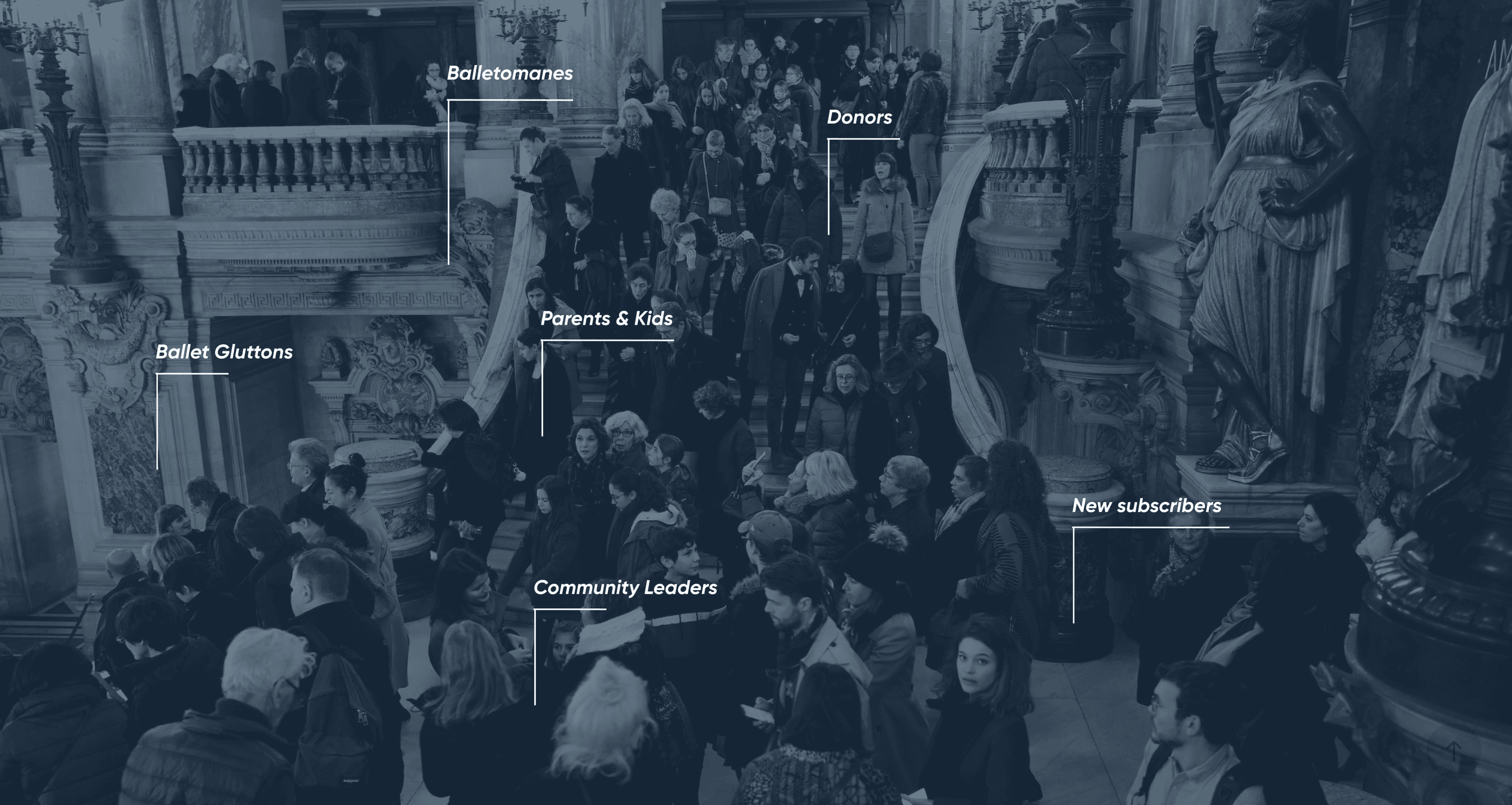
The research phase commenced with conducting interviews with current users of the website, with each user representing a specific predefined archetype. Carefully tailored questions were prepared for each persona, ensuring that we could gather insightful and relevant answers from them.
Each interview session lasted for approximately 30 minutes, during which the participants shared their comprehensive experiences encompassing both physical and digital aspects. This approach allowed us to gain a deep understanding of how users interacted with the website, identifying pain points, and uncovering opportunities for improvement.
Formation
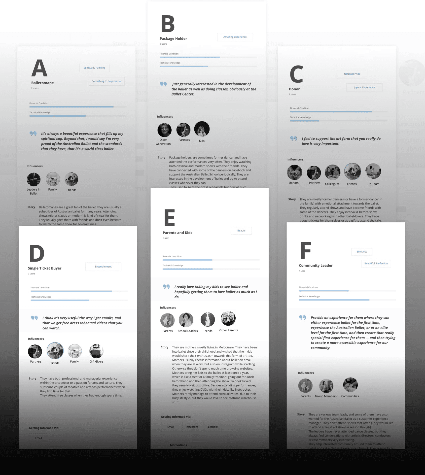
After conducting interviews, analyzing transcripts, and thoroughly reviewing general information about the already established archetypes, I successfully crafted six distinct personas, each designed with the following structure:General: This section includes key quotes, relevant keywords, and other pertinent information.
Biography, Motivations, Tasks on Website, and Goals: Here, the personas’ background, motivations, the specific tasks they intend to carry out on the website, and their ultimate goals are detailed.
Physical Frustrations: This section addresses real-world frustrations that users might encounter, such as issues with WiFi connectivity in a building, which may impact their experience.
Digital (Website-related) Frustrations: Here, I focus on frustrations specifically related to the website itself, examining potential challenges or shortcomings that users might face while interacting with it.
Following the creation of user personas, I conducted an in-depth analysis of their Frustrations, carefully categorizing them based on their severity and relevance. These frustrations encompassed aspects related to both the website’s functionality and the overall user experience.
By evaluating General Frustrations, I gained valuable insights into the broader landscape of the users’ experiences. This approach allowed me to identify various opportunities for digitally addressing and resolving issues via the website. By considering the bigger picture, I could effectively pinpoint areas that required improvement and implement solutions that would enhance the overall user experience.
Website-related Frustrations

User Journey
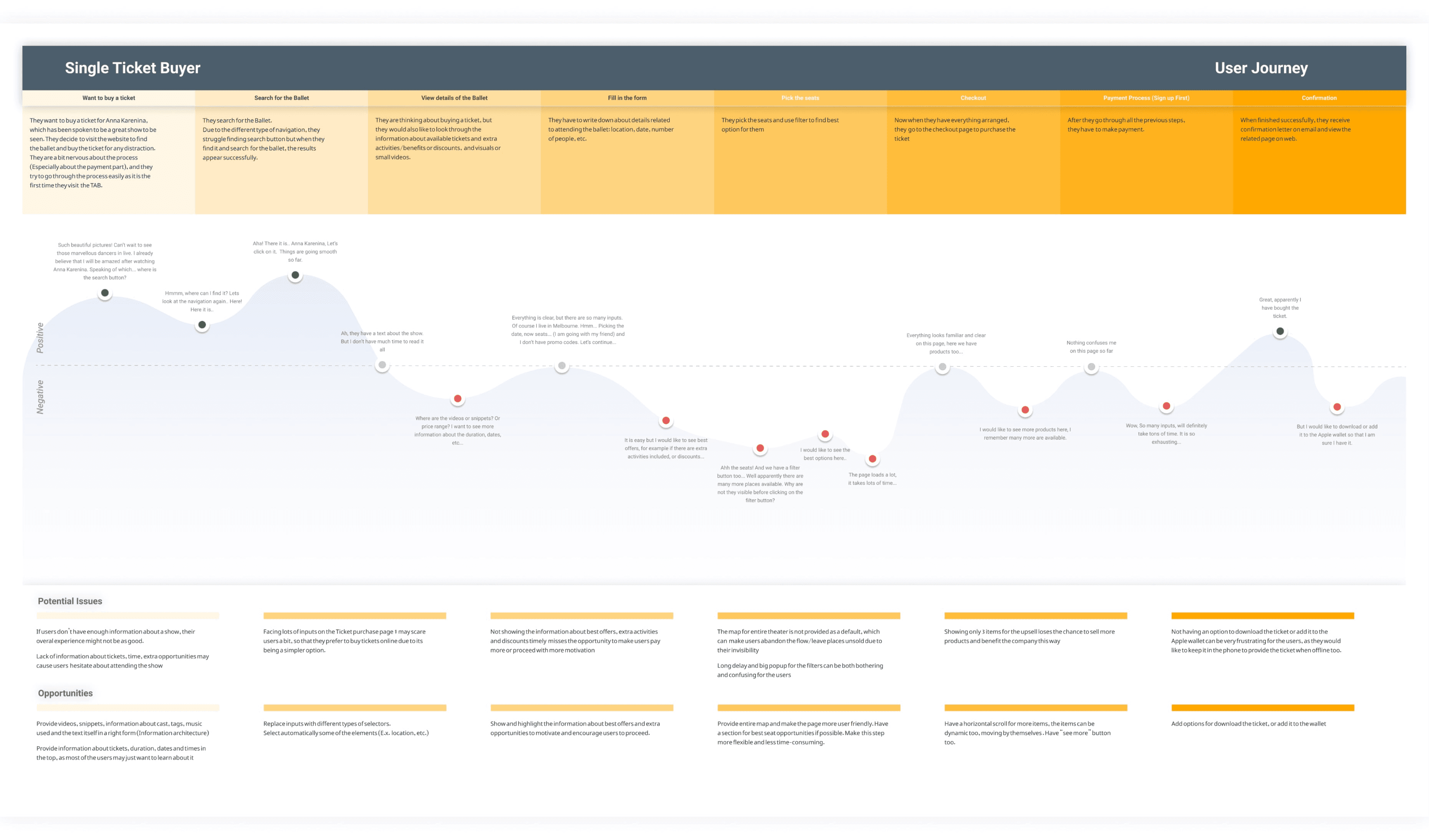
Once the Archetypes were established, I proceeded to create a comprehensive user journey specifically tailored to the process of purchasing a ticket, as it is one of the most frequent actions on the website.
The user journey is laid out with detailed descriptions for each step, covering the entire process while also delving into the emotions and feelings experienced by users along the way.
To foster empathy towards users, I incorporated relevant user quotes, which were grouped under the respective steps to provide a more personal touch.
The user journey diagram is divided into two main sections - positive and negative. Positive thoughts are indicated with blue circles, negative ones with red, and neutral sentiments with grey, facilitating a clear understanding of the users’ emotions at different stages.
Using wave-like patterns on the diagram, the focus areas and potential sources of frustration for users are easily identifiable.
To proactively address potential issues, each step is accompanied by a verbal articulation of possible challenges and effective ways to avoid them, ensuring a smoother and more pleasant user experience throughout the ticket purchasing process.
Navigation & Site Maps
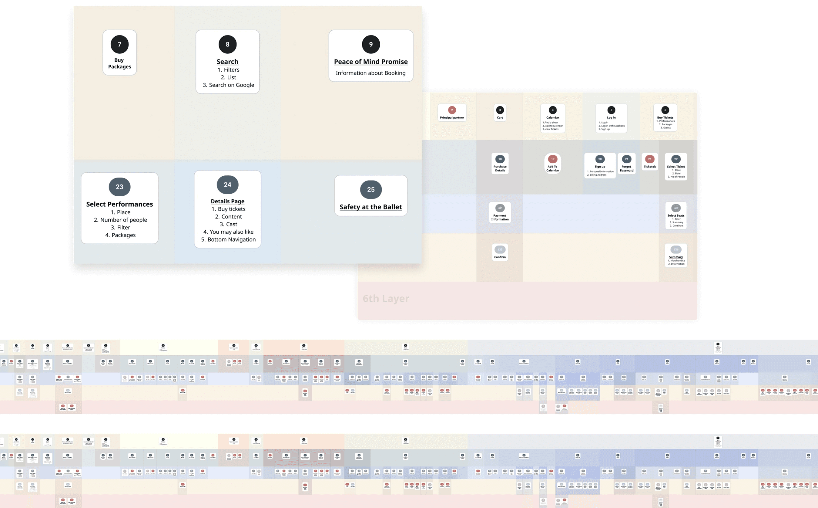
I constructed a Navigation Map to gain comprehensive insights into the existing website’s structure. Each card was thoughtfully linked to its respective page on the live website, enabling easy verification of page interfaces. For repetitive pages, I introduced numbered cards without texts to maintain clarity and consistency. Ultimately, the website was revealed to consist of 6 distinct layers.
Afterward, I utilized the gathered data to create a Sitemap, excluding the numbered cards. The Sitemap served as a valuable tool in identifying complex areas of the website that might be challenging for users, highlighting the need for simplification. Additionally, each card on the Sitemap was linked to its relevant live page, allowing for swift navigation to any desired section as required.
Information Architecture
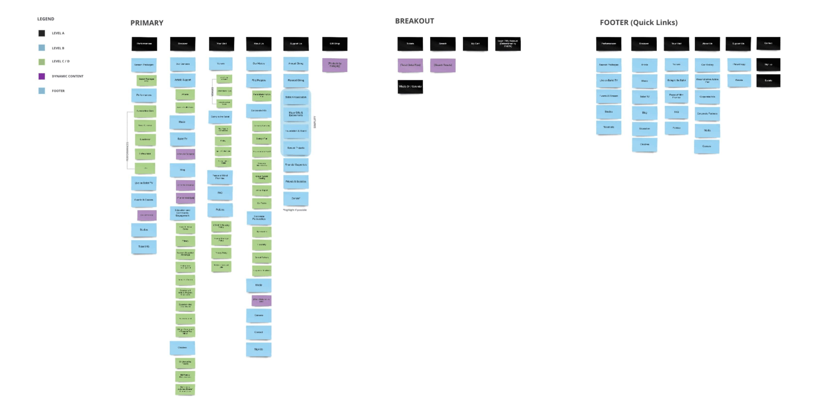
During the Exploration Phase, the final step was dedicated to crafting an optimal information architecture for the website. To achieve this, we employed simple cards, carefully organized into distinct sections and grouped under Parent Cards.
Following the workshop, I successfully arrived at an updated and simplified version of the website’s structure, resulting in a significantly improved user experience (UX).
Summary
At the conclusion of the discovery phase, I gathered crucial information necessary for the subsequent step of Wireframing.
Archetypes: These are instrumental in organizing and rearranging pages to align with users’ expectations, ensuring a user-centric approach.
User Journey: Utilizing user journeys aids in the construction and testing of related flows, optimizing the overall user experience.
Sitemap/Navigation Map: Familiarizing oneself with the existing website’s mapping facilitates redesigning and enhancing its overall structure effectively.
Information Architecture: Thoughtfully distributing essential sections and establishing a well-structured content framework lays a solid foundation for developing a user-friendly product.