Data Visualization
Different ways to visualize different data
Data Visualization Principles
All the information is based on the various sources like material design principles, apple and adobe visual guidelines, etc.
Part 1: Line Charts
General Line Charts show how something changes throughout the period of time. It is usually used in the following cases:
💵 Finances
🧬 Health Statistics
🕰 Chronologies
📣 Marketing Presentations
🌤 Weather Monitoring
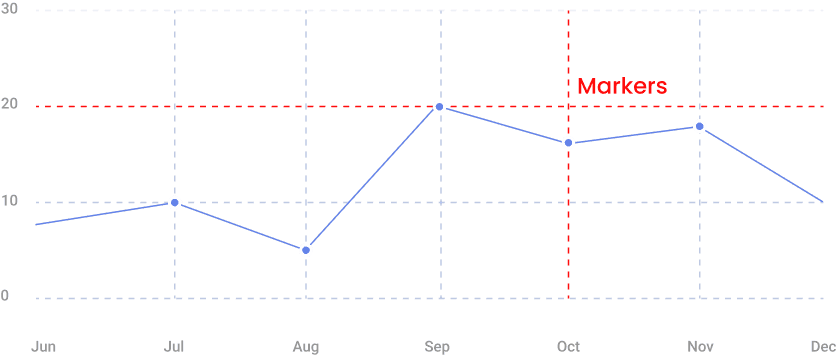
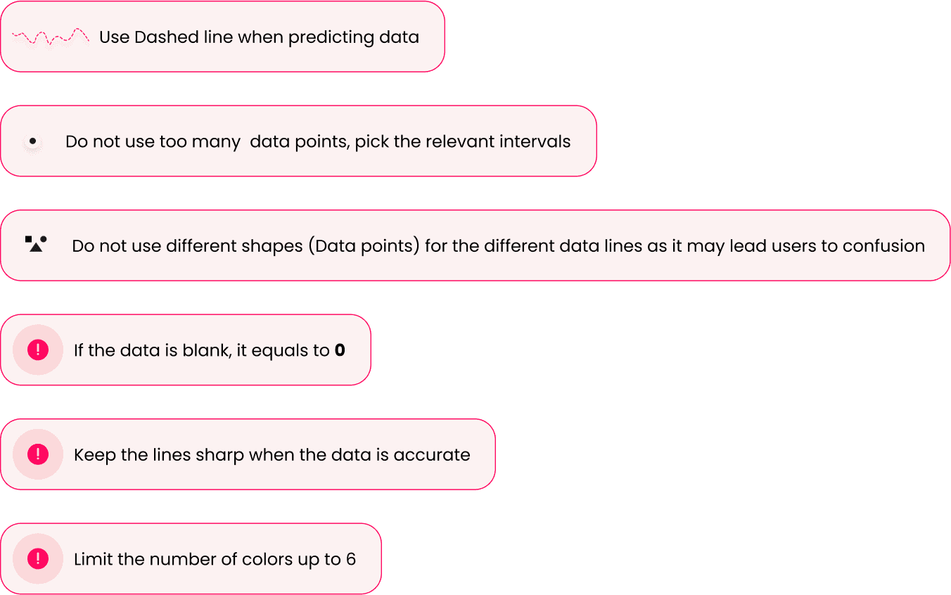
Y Axis usually represents numeric values, price, age, etc. X Axis represent Temperature, Age, Percentage, Distance, Time Period, and many more. Line Charts are used When there are fewer types of data to represent (Up to 3-5). Structure The small dots that you see are known as markers and they indicate the specific time when data was collected. Using these markers is recommended if you’re interested in knowing the exact data for each time period, rather than just an overview of the general trend.
💡 The Grey Pattern helps users find corresponding value on the Y axes, for a value on X axes. To keep the visual uncluttered, it’s best to use the subtle grey net. This will prevent it from overwhelming the overall design. But do not make it too subtle. Both X and Y axis should be numeric. Data should be displayed with a continuous scale.
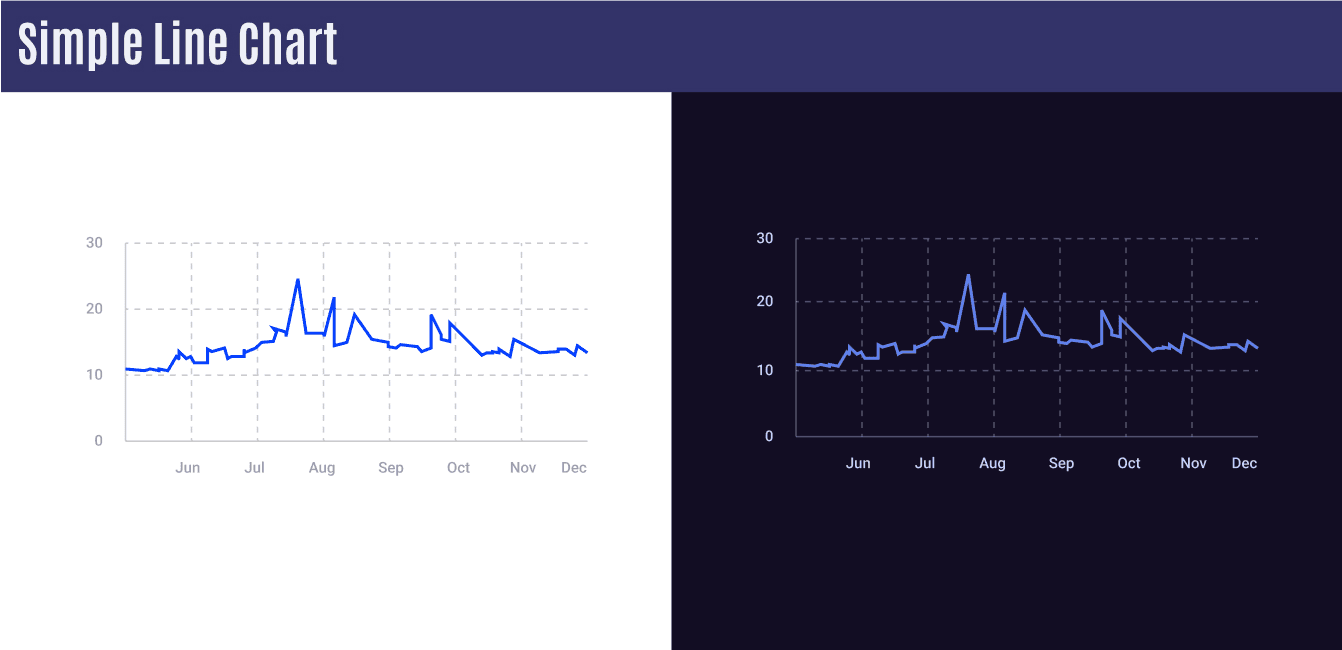
Simple Line Charts
Charts that showcase a single type of data within the time framework.
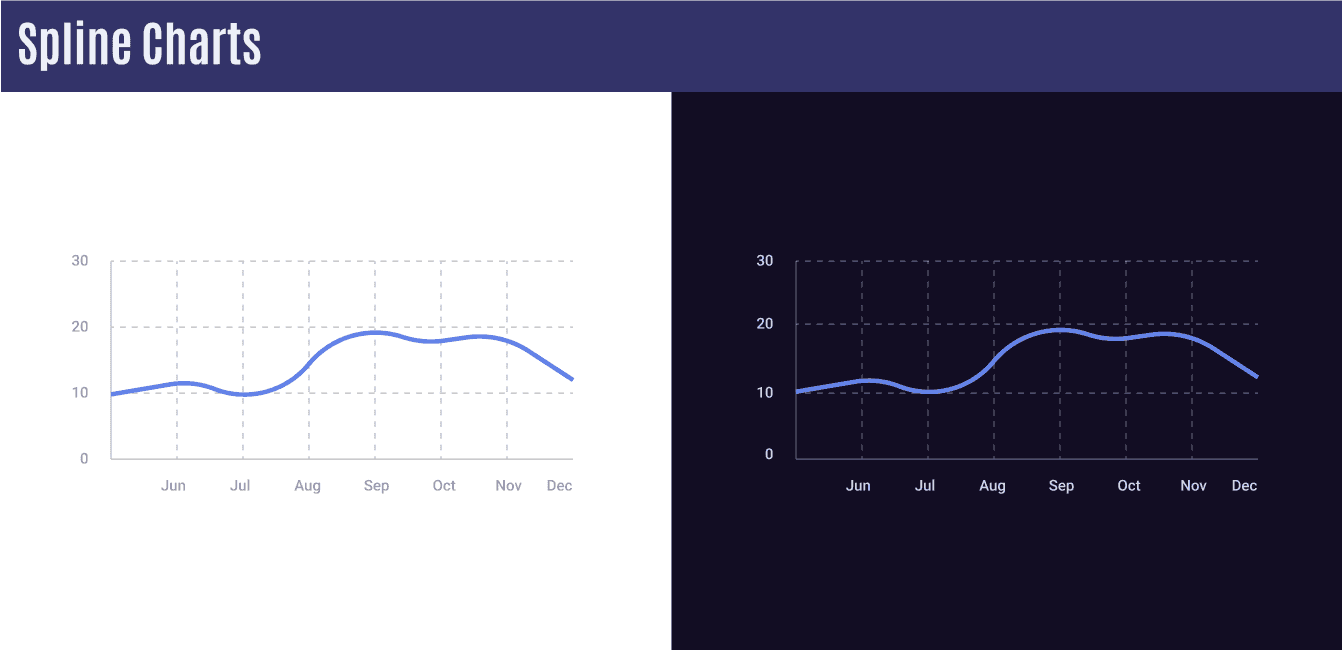
Spline Charts
Spline charts are known for their smooth and curved visuals, which effectively depict trends while also maintaining an aesthetically pleasing appearance. This makes them a great choice for displaying data in a visually appealing and informative manner.
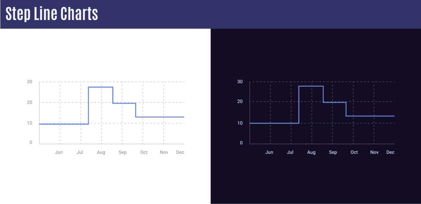
Step Line Charts
Step line charts are typically used when values do not change frequently within a particular time frame. This type of chart can effectively display the data in a clear and concise manner, making it a great option for visualizing static data over time.
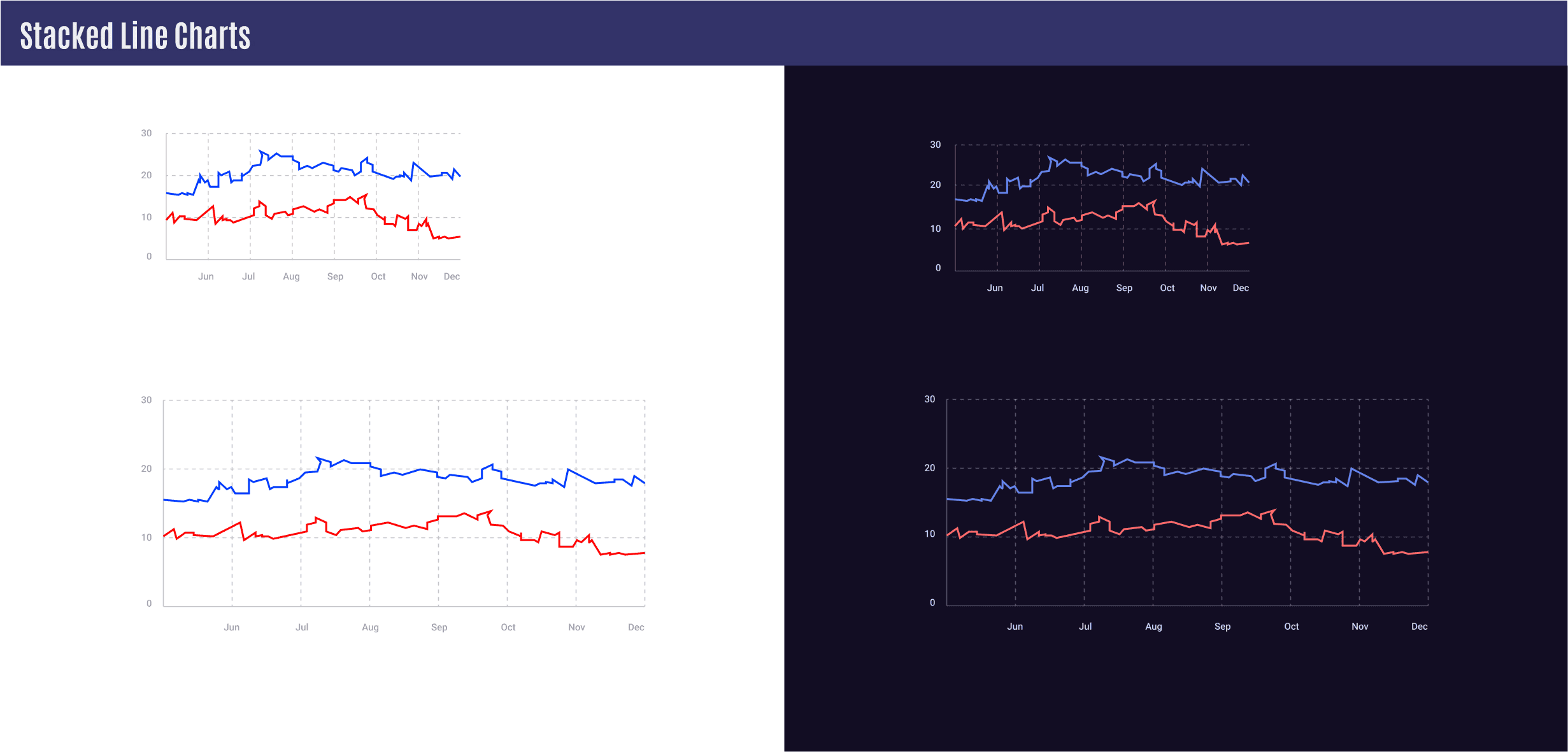
Stacked Line Charts
Often utilized to display time-related differences between two or more trends.! Use contrasting colors to easily differentiate between different data variations, but pick the colors carefully too.
💡 ! Avoid adding more than 5 lines (3 is ideal)
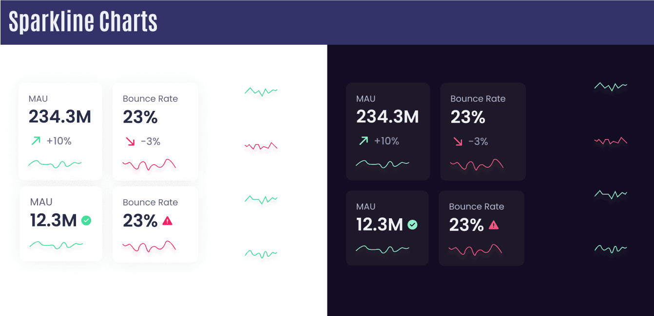
Sparkline Charts
A simplified chart without axes is designed to quickly convey a general sense of the situation, without providing precise details. This type of chart can be helpful for users who already possess a basic understanding of the data set being analyzed.
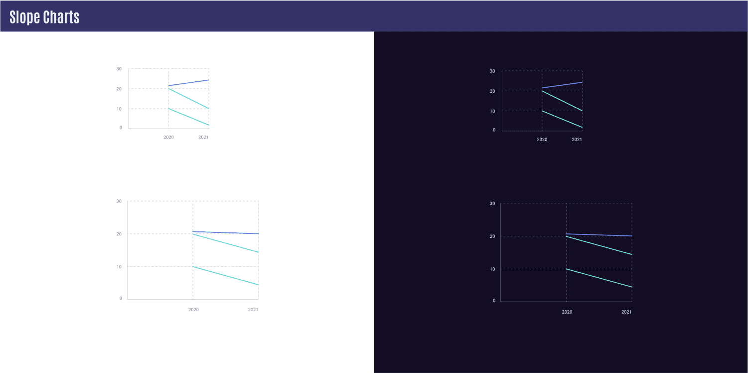
Slope Chart
A type of line chart that features a series of lines with a starting point and an ending point is often used to compare changes between two dates. It’s important to keep the chart from becoming too crowded with too many lines, as this can make it difficult to read and interpret.
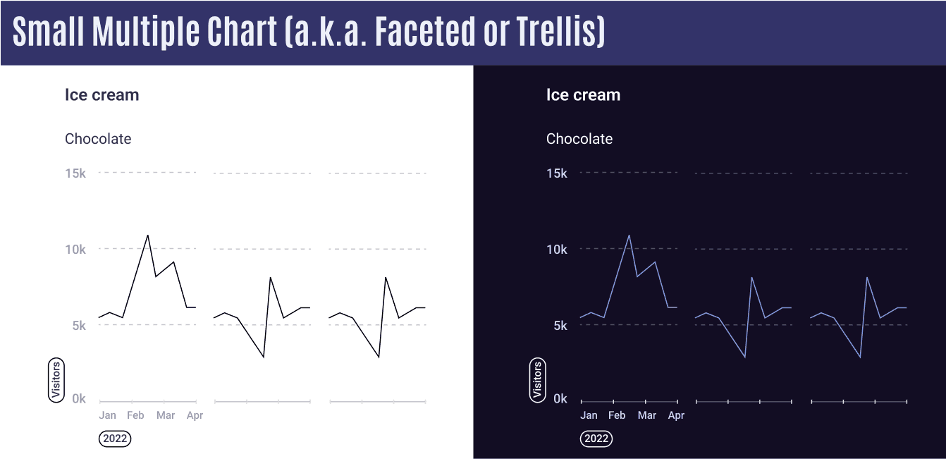
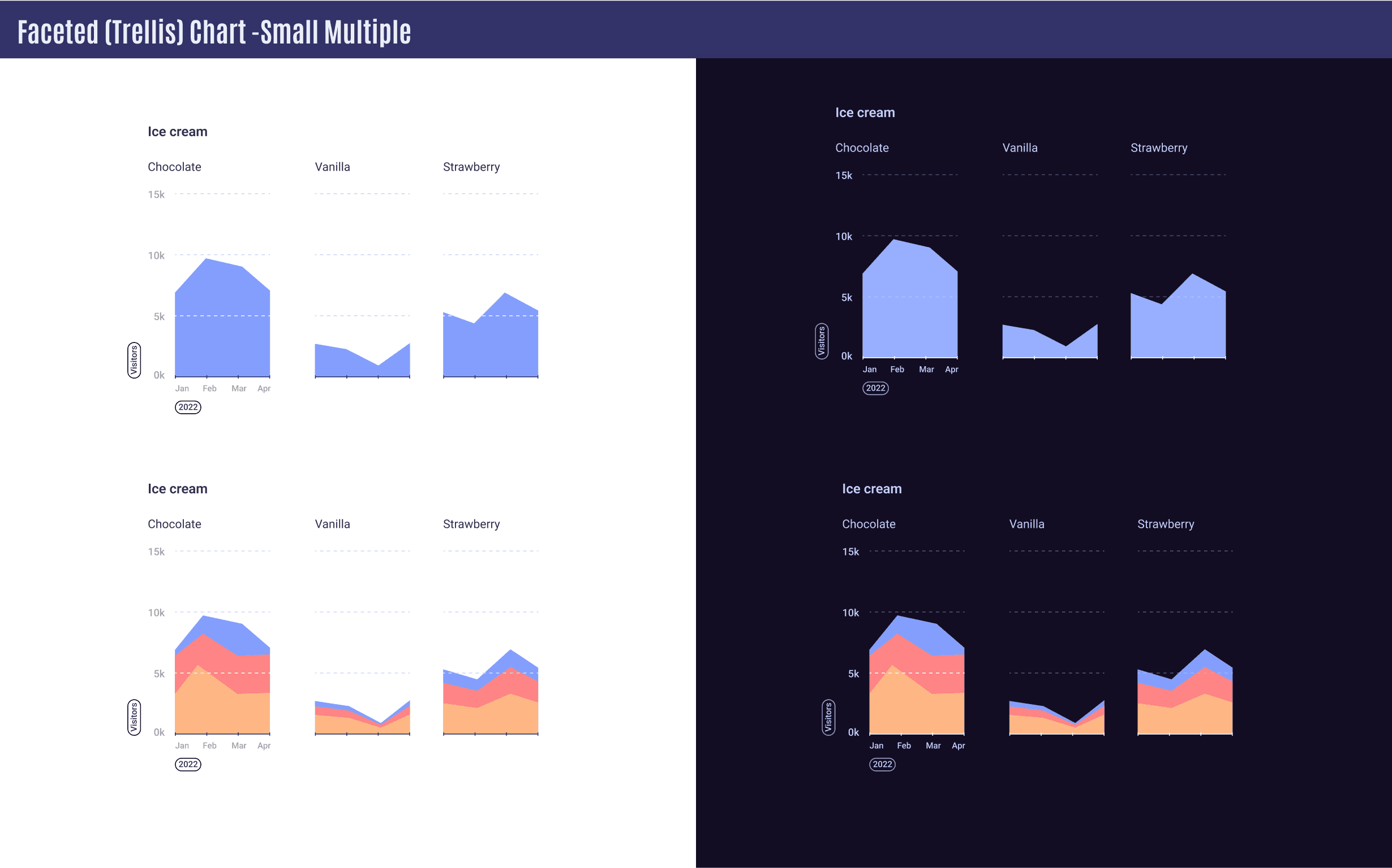
Small Multiple Chart (a.k.a. Faceted or Trellis)
Useful when comparing lots of types of data. Each chart should have the same scales.
Part 2: Area Charts - General
Area Charts are often used when you want to show how data changes over time and also the different categories that make up the data. Area Charts is describing how percentage rates have changed over time. For instance, if you want to show the number of people who used a particular airline during a year, and also want to show the number of men, women, and children who used the airline, you can use an area chart. You can choose to display the data as percentages or as exact numbers, depending on what you want to emphasize.
Just remember that for each date, the percentages should always add up to 100%, no matter how the data is divided among the categories.
Area Charts = Pie Chart + TimeX axis should be always about time & should start with 0.
Y axis is all about age, numeric values, price, etc.
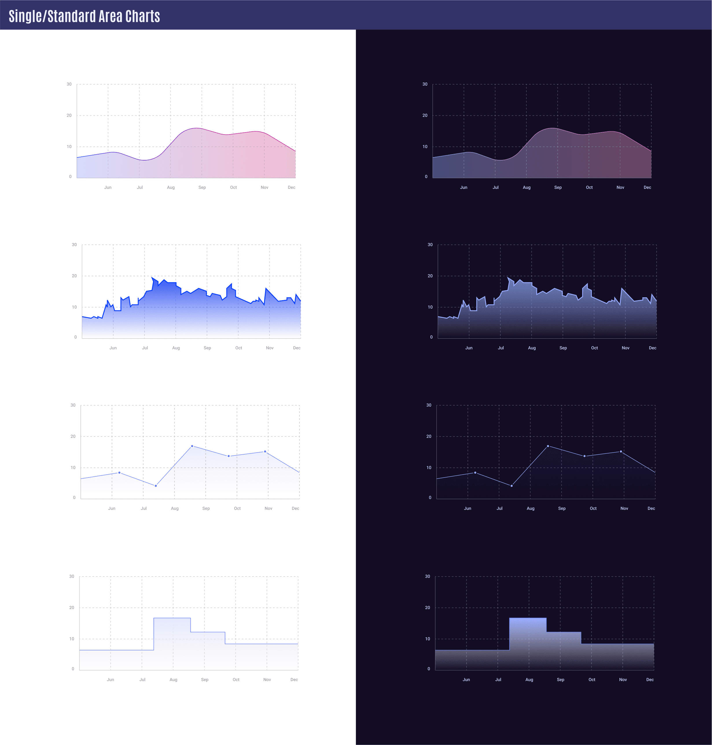
Single/Standard Area Chart
Used to visualize changes for one specific type of data. This chart can be interchangeable with a standard line chart.
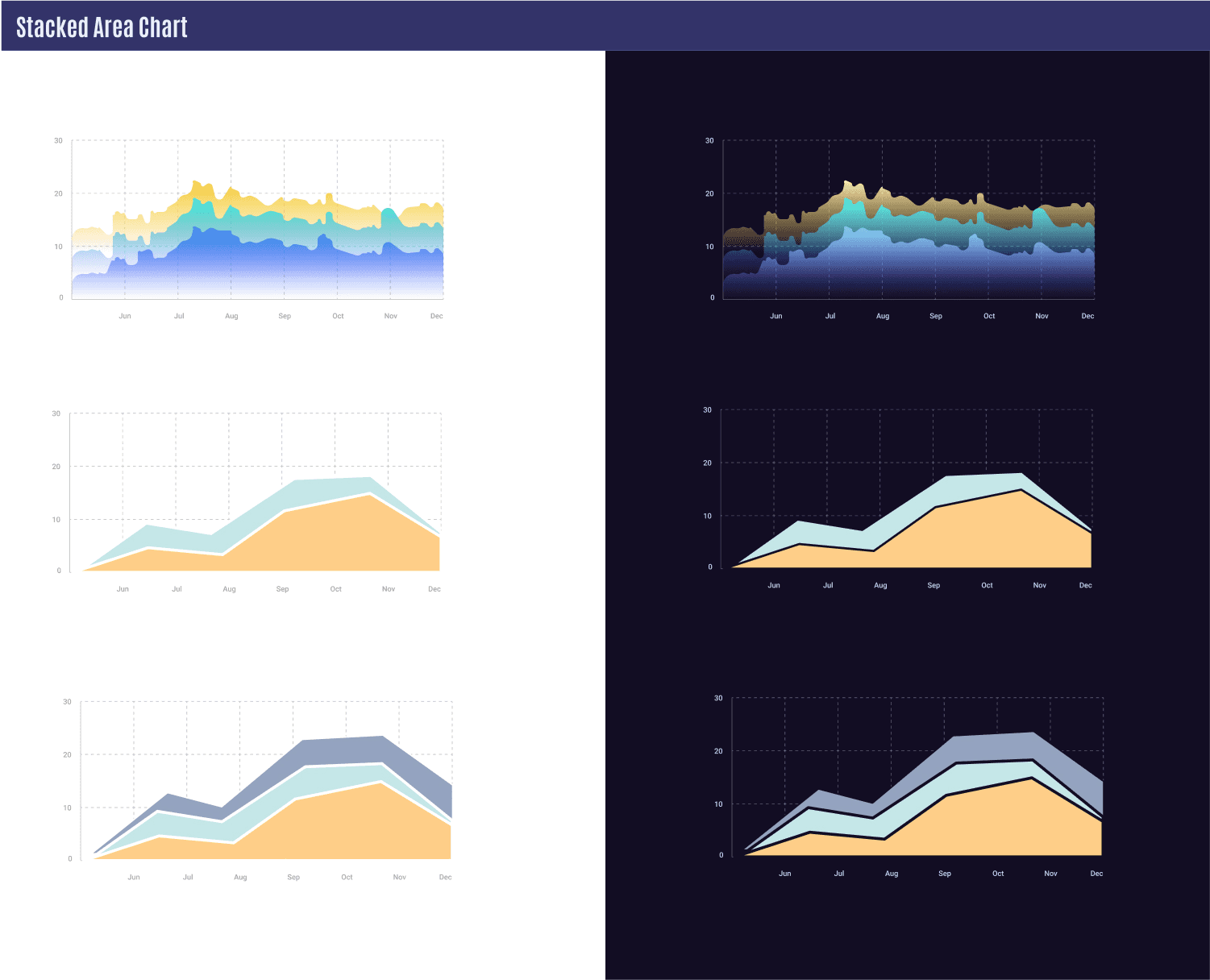
A Stacked Area
chart is a helpful tool for monitoring changes in the total value and how it is distributed among various groups over a specific period of time. Comparing the heights of the stacked areas can quickly reveal which group is performing better than the others.
Tips
💡 1. Keep lines sharp
💡 2. Keep the contrast between areas
💡 3. Use colors logically for each data set
💡 4. Max number of colors should be 6
💡 5. Start with the highest data in the bottom and continue accordingly.
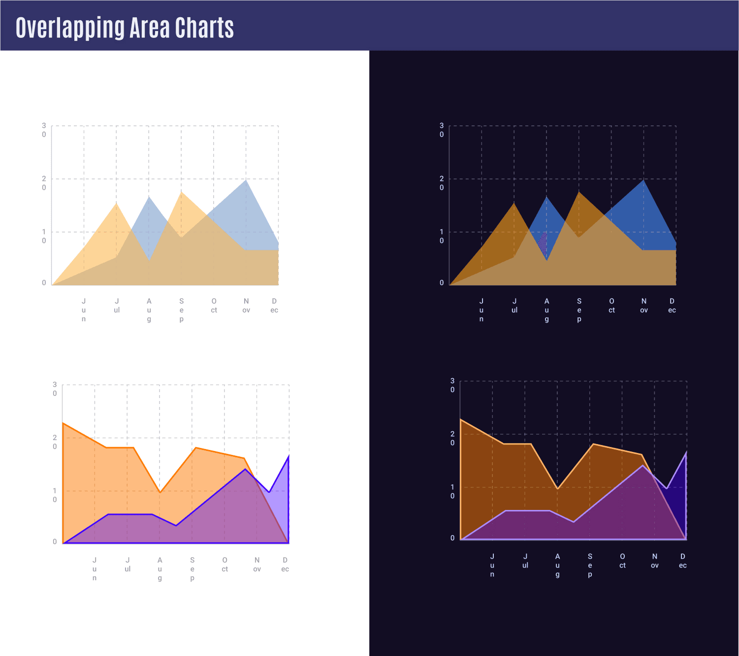
Overlapping Area Charts
An overlapping Area chart shows how the various groups are compared to one another over a specific period of time. Comparing their heights and overlaps reveal which group is performing better than the others.
Make colors transparent to keep data visible for each group.
Avoid Overlapping Charts if there are more than 2 Categories.
Faceted (Trellis) Chart - Small Multiple
Such charts help compare different types of data.
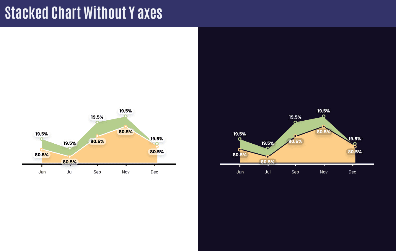
Stacked Chart without Y Axes
Used when each data value is equally important at different periods of time.
\