MyMarket - eCommerce App
Complete process for designing a mobile app
Mymarket stands as Georgia’s largest B2C & C2C eCommerce platform, boasting a user base exceeding one million. The project’s objective was to develop an app accessible to users of all types. To accomplish this goal effectively, I navigated through multiple phases:
- Research current market
- Wireframing
- UI Design
Phase 1: User Research
GATHERING DATA
For the general statistics, I used Datareportal, which provides useful and updated data about the digital situation in a region. I gathered information about the percentage of people using the internet with a mobile phone, which websites are most frequently used, the number of people who buy online or pay bills, and so on.
I used Typeform to create a general survey with qualitative closed-ended questions and a couple of quantitative open-ended questions. I then posted it in relevant Facebook groups and received about 100 responses.
And finally I analyzed direct and indirect competitors worldwide & in our region and examined the structure of several global e-commerce platforms along with their UX/UI solutions.
Due to the pandemic situation, I conducted interviews with the Customer Support, Sales, and Content teams via Google Meet. Their feedback helped me to identify current pain points and highlights that were important for users while using the web. With their consent, I recorded the meetings for further analysis.

Phase 1: User Research
DISCOVER
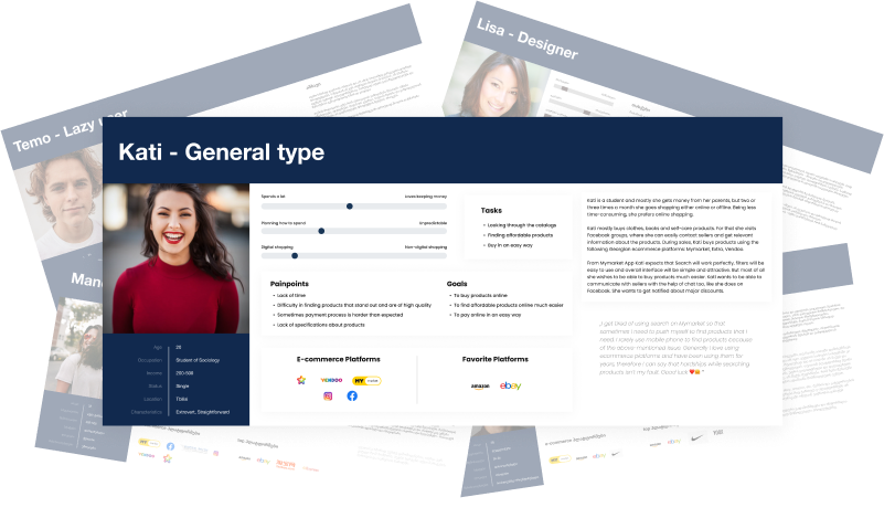
Based on the qualitative and quantitative data gathered, I created 5 user personas along with corresponding user stories. I augmented each persona with actual quotes from the surveys and interviews to enhance their realism.
Phase 2: Wireframing
CREATING LOW-FIDELITY WIREFRAMES
I dedicated a month to wireframing the entire product, ensuring that all flows and edge cases were predefined before commencing UI work. I conducted weekly meetings to present the prepared structures to stakeholders, whose feedback allowed me to verify the technical and functional robustness of the flows and identify any areas requiring refinement. I utilized Figma for creating wireframes and relied on Sticky notes to jot down feedback and comments, streamlining the consideration process for later adjustments.
Phase 2: Wireframing
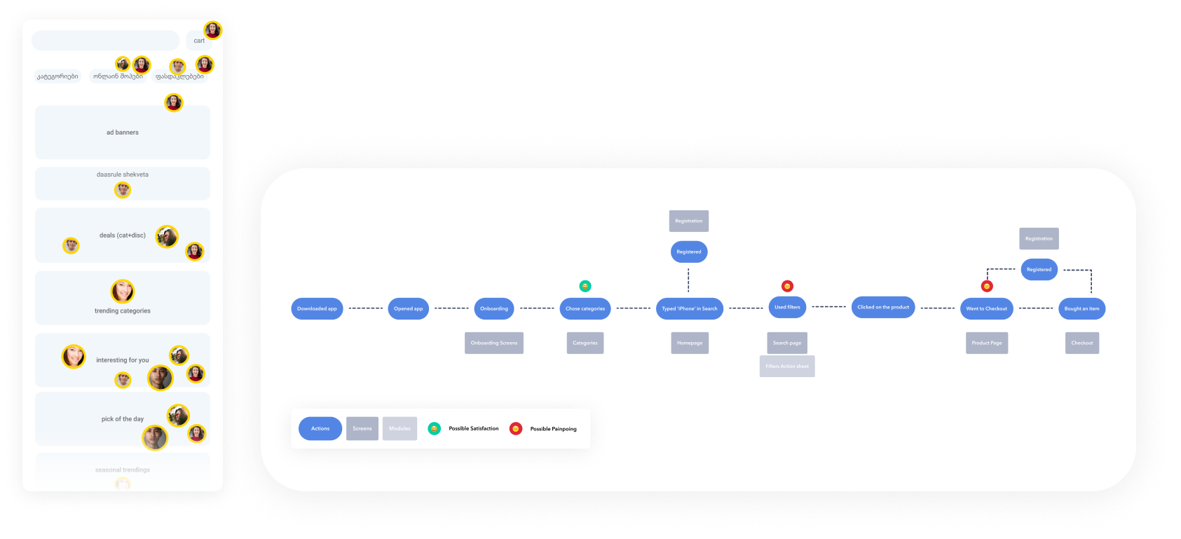
ANALYZE
After creating the wireframes, I decided to place symbols of user personas on the sections that would interest them. The more a section appealed to a persona, the larger the symbol. This method allowed me to easily grasp the overall picture and understand user interests more effectively.
Phase 3: UI Design
DESIGN SYSTEM & FINAL VISUALS
In the end, I delivered refined visuals, complete prototypes, and a comprehensive design system that included all necessary elements.
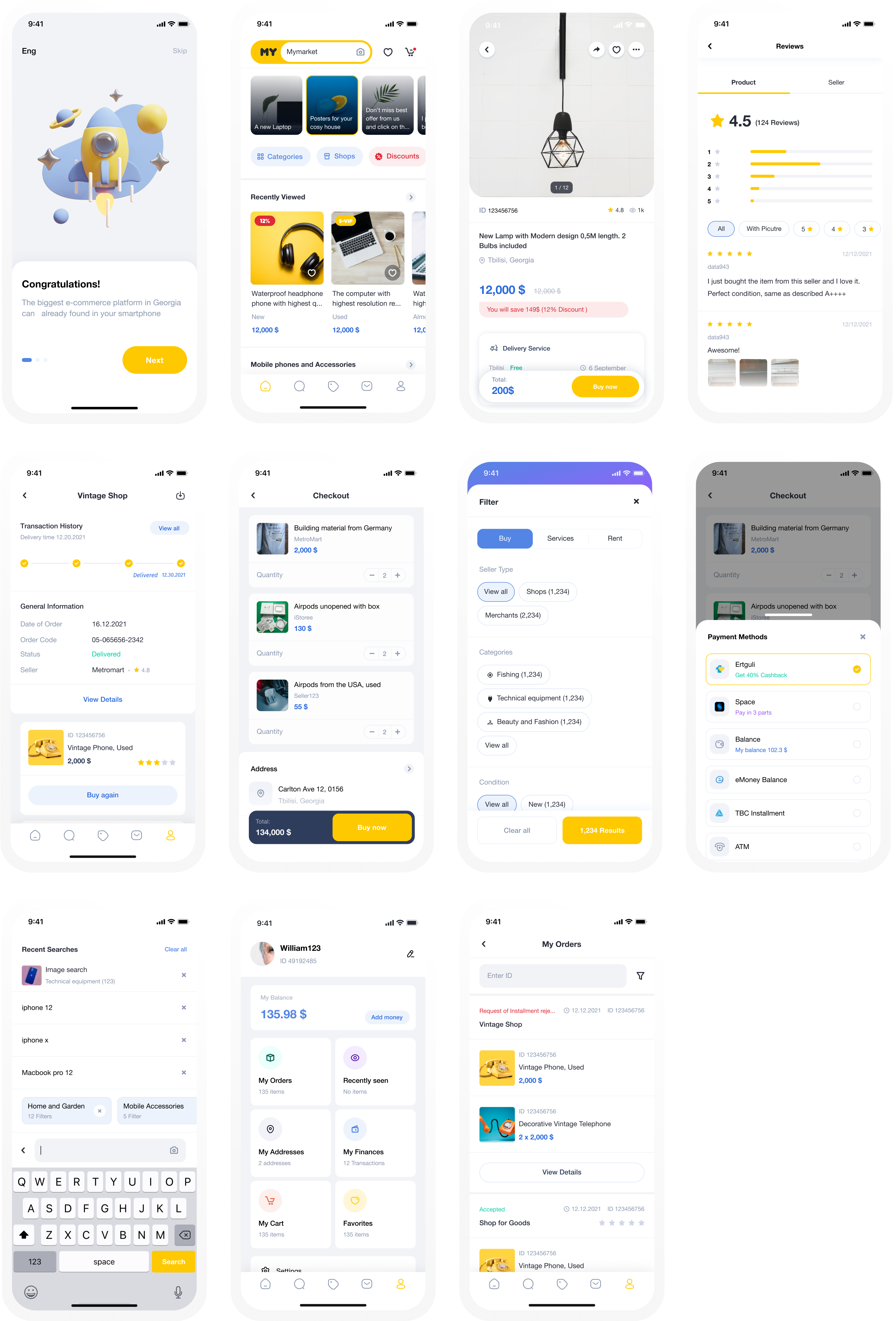
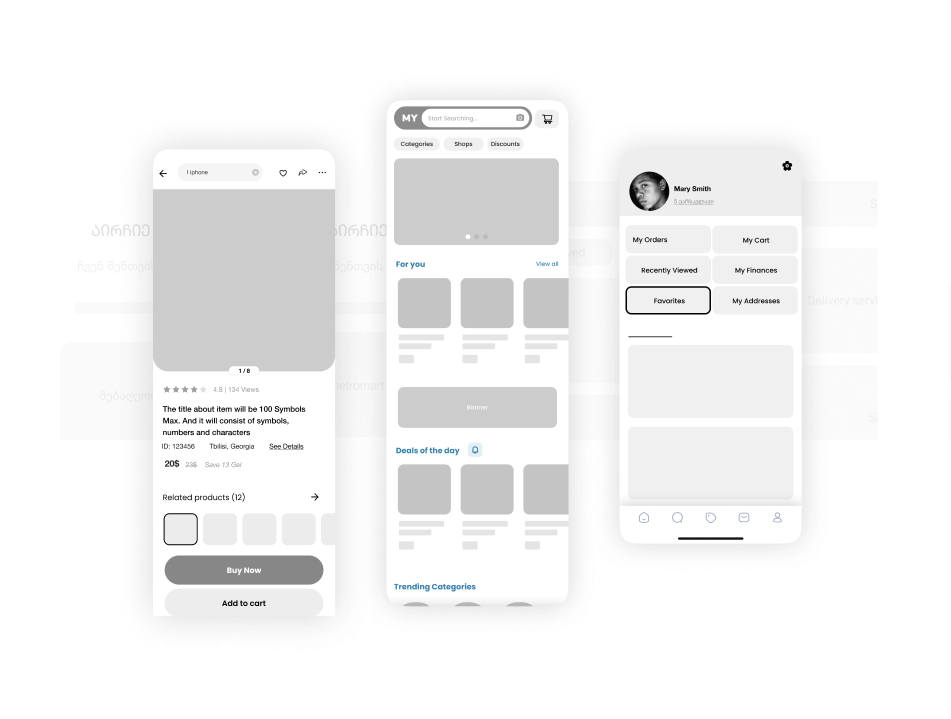
Some Highlights
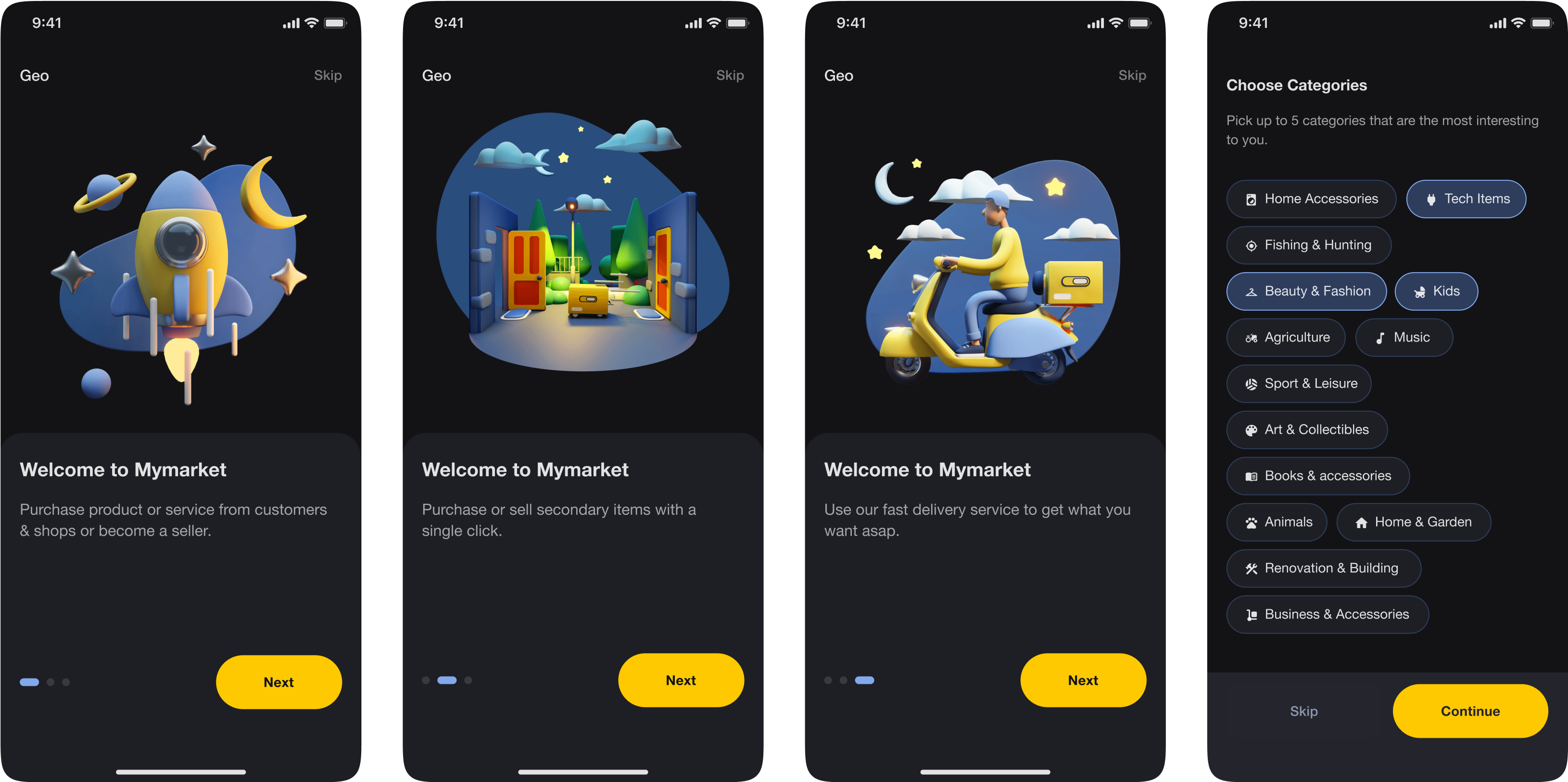
Onboarding Flow
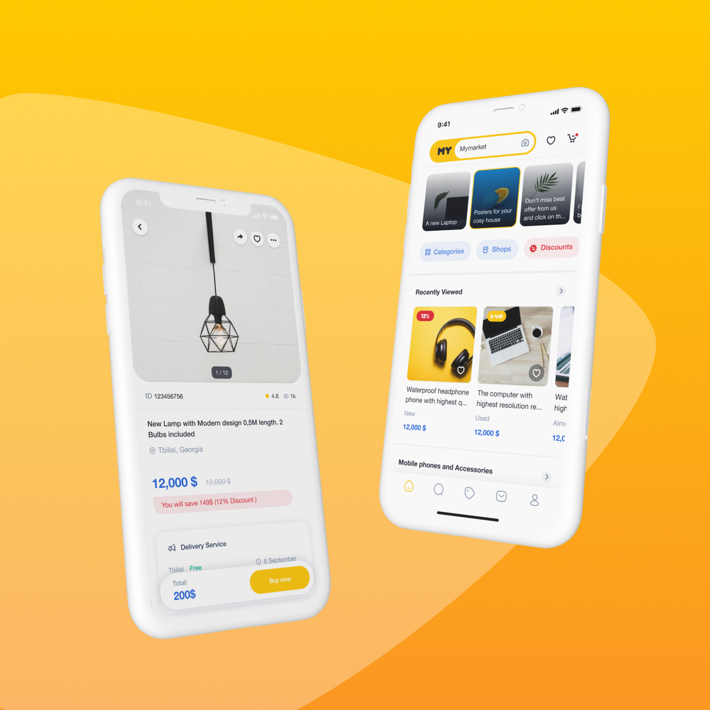
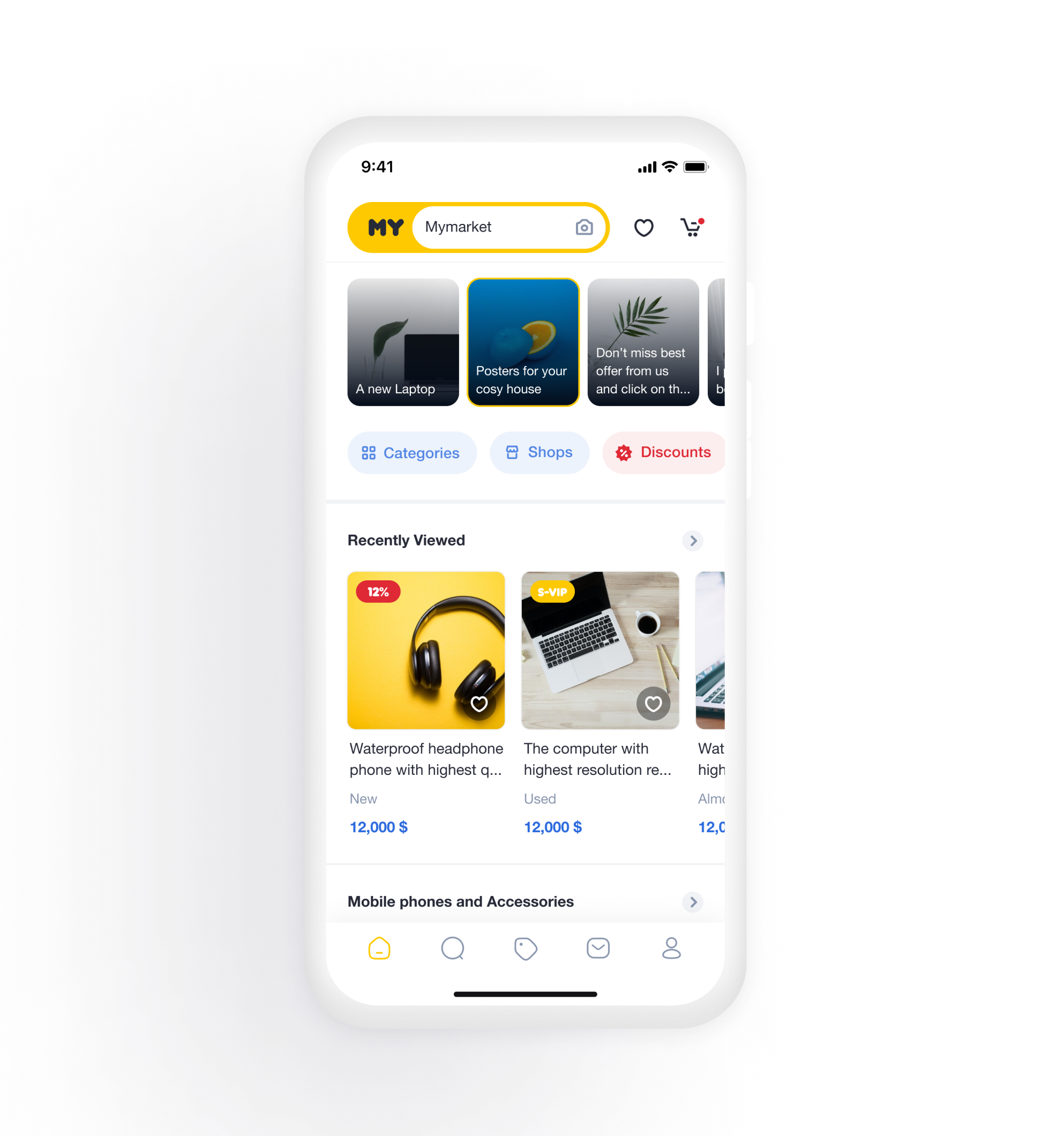
Homepage
- Personal Experience Section: This includes recently seen products and similar products related to the last product opened by a user.
- Discounts & Best Offers Section: This features the deal of the day and general discounts, tailored to user interests and discounts.
- Personified Section: This highlights products and shops/sellers related to the categories chosen by a user during onboarding.
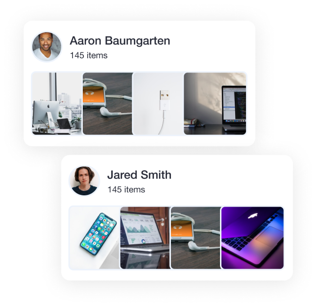
Individual Sellers Vs Shops
On the web platform, individual sellers were overshadowed by the shops. My challenge was to find ways to highlight the sellers. To address this, I decided to build special sections for top sellers on the homepage that would attract user interest. These sellers would offer products related to the interests chosen by users during onboarding.
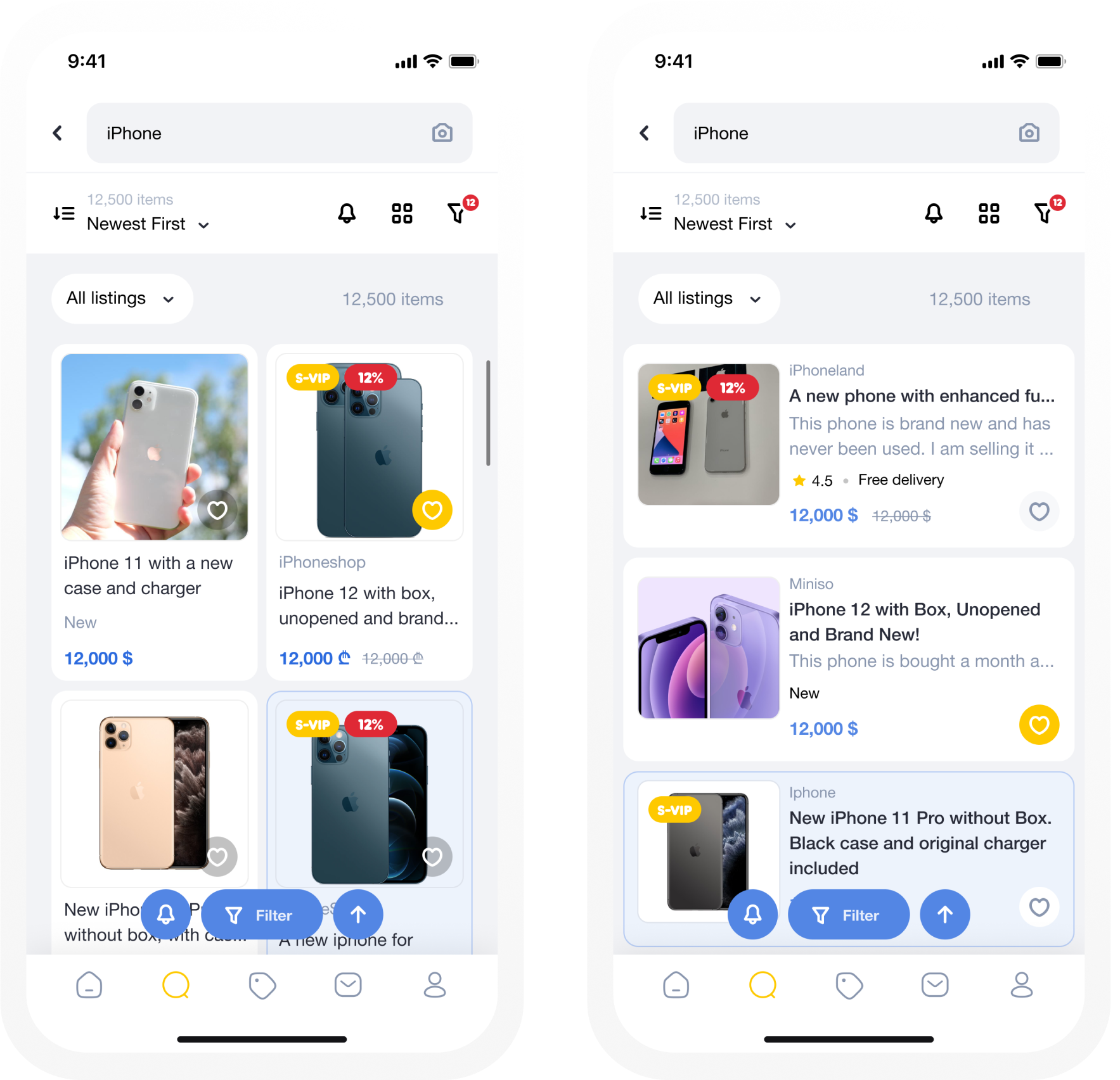
Grid View VS List View
In the case of the list view, items are quite informative. Therefore, the title and description should be provided in full, along with other relevant information.
Grid view allows users to quickly browse products and obtain visual information swiftly. Emphasis should be placed on the photos.
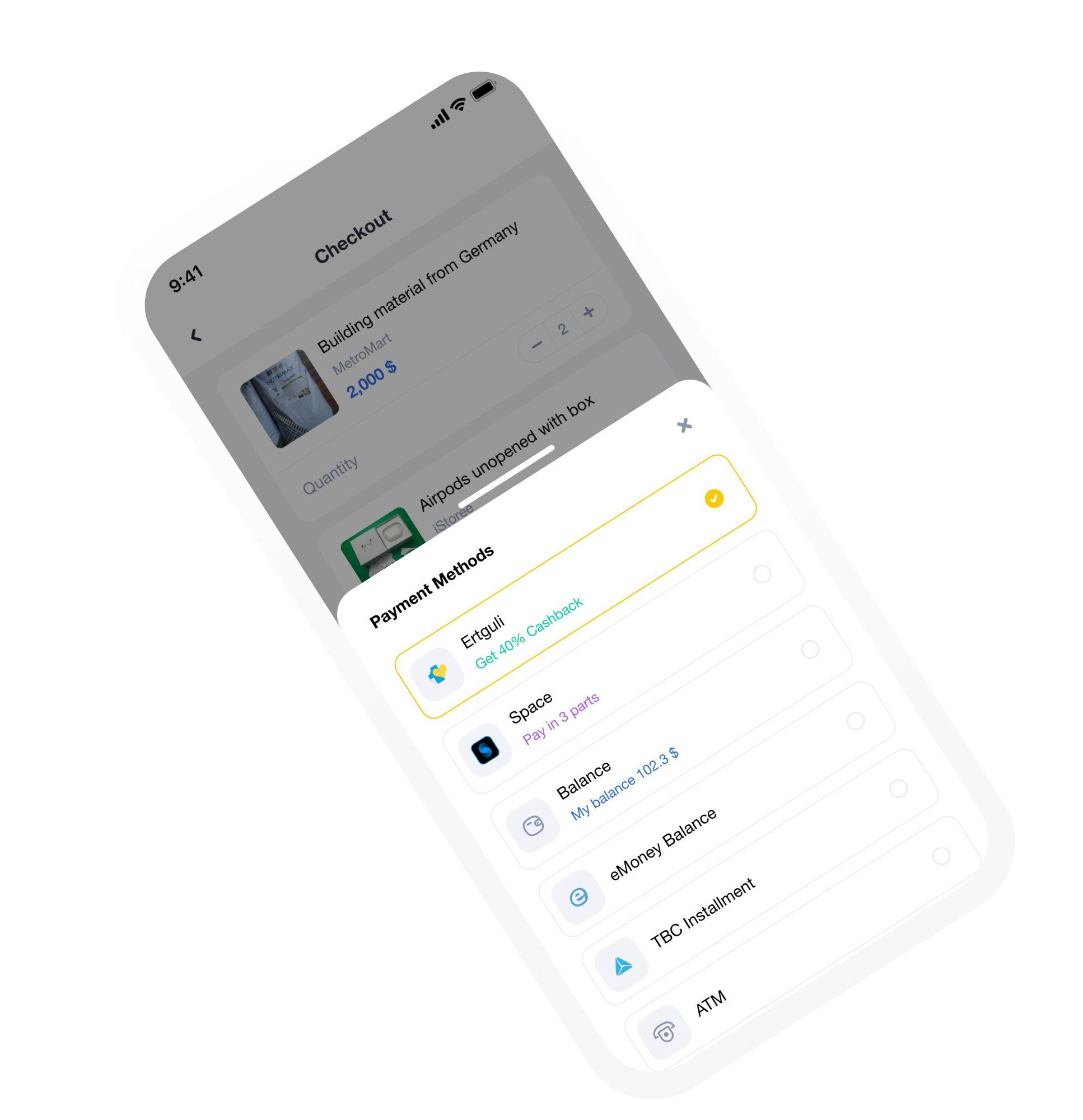
Payment Methods
The payment methods action sheet functions like an ecosystem where methods are prioritized based on the offers they provide, such as cashbacks and discounts. This approach benefits both buyers and payment service providers.
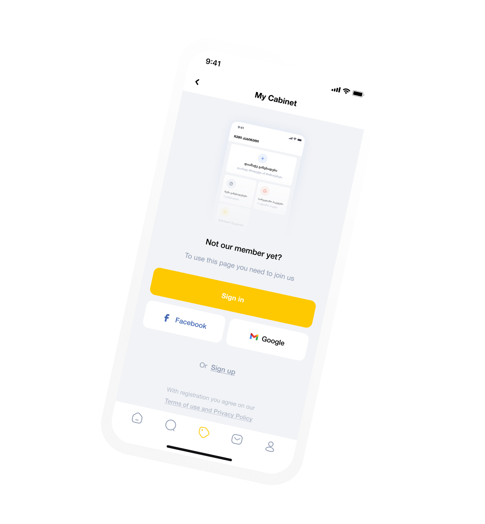
Empty State
Showing a preview of the screen that will appear after registration would demonstrate to unregistered users the exact benefits they would receive upon joining the platform.